This page includes all the preparation and the journeys of all my decisions for my final soap opera design. I believe if you do something, there should be a reason behind it. What ever design choices I have pursued, hopefully the background reasons will come across and therefore make it all that more powerful and creative. This page shows the process of creating an original title for the soap. To view other stages in the creation of the soap opera, select one of the following.
|
|
First of all, I want to look at the title and how I would like it to be represented by the style.
Deciding what title to use for my soap opera is a big decision I feel. After interviewing members of my target audience and learning that they like Hollyoaks the most, I will try and give mine a style similar but obviously with its own unique appeal.
But first of all:
Why did people like Hollyoaks?

1. The colour- blue and pink represent both sexes (advertising to both audiences)
2. Simplistic and basic - it has to be rememberable, by making it too detailed you would forget it.
3. The girl and boy sign- representing the culture and storylines
On an extra note, one person said they liked the fact that it looked like a nightclub sign. This is interesting as the target audience are the type of culture to go out clubbing. Also, one of the main settings of the soap is a nightclub (the SU bar). This is a subtle design idea that is not only creative but links with the show. Every aspect of the title is relevant.
Brainstorm of Broadway Park subjects:
Money- the credit crunch, a mixture of richer and poorer cultures.
School- a lot of the characters are at school
Age group- the characters are mainly youth
First, I am going to look at the 'Broadway' part of the title, I will look at fonts and relevant imagery that comes to mind. In my plan, Broadway will represent the 'richer' characters of the soap, leaving the casual word Park with the ordinary working class. I'm not afraid to explore over the top ideas to represent both words as i'm just using them as a base, and as long as they stereotype the word at least a little then i'm happy.
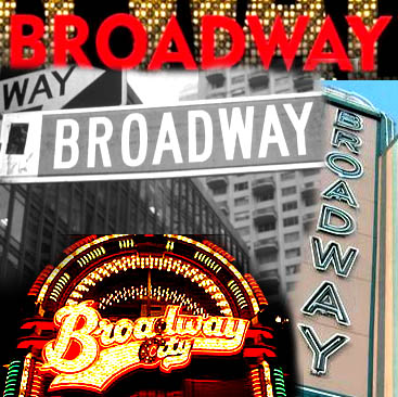
'Broadway' is usually linked with the famous Broadway theatre. Broadway theatre is usually considered to represent the highest level of commercial theatre in the English-speaking world. In the acting world, it is probably the best possible place to be, it is seen as glamorous, glorious and flashy. Linking with the richer Broadway park family the 'Howards', they are people who were living it glamorous..especially in comparison to the 'Langston' family. If taking it to extremes, they could be seen as the highest place to be in the money world (comparing with the others in the show). I always associate Broadway with the word 'money', so I want to keep the idea of the glam Broadway theatre but use money to reflect to the word more as that is more realistic for a soap.
So moving on from this idea, I will now look at the word MONEY.
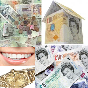
As the credit crunch is a problem we are all facing as a population at the moment, I would like the soap opera to demonstrate suffering too. However, the title will usually always stay the same through the years. So having a title relating to the credit crunch will not be relevant in hopefully..a few years time. However, no matter what we will always have the 2 familys, the richer and the poorer. So a money related theme will not cause any harm and still represent the familys.
Similar to Neighbours 'Ramsay Street' which is the link between the road of the two families.
'Broadway Park' is the link between the two main families also.
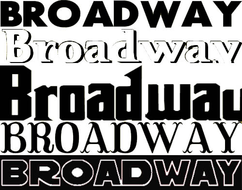
NOW I WILL LOOK AT RELEVANT FONTS

Here I am looking at the types of font that appear on a money note, I will use these when considering the font for my title. This will be subtle but will hopefully symbolize the subject without being too over the top. Hopefully some people may recgonise or subconsciously think about the connection like Hollyoaks and the nightclub.
FONTS
Based on the font used on the money note above, i tried to find similar looking fonts on a website called www.1001fonts.com. When showing these fonts around, my target audience liked the top and bottom one the most. The middle two looked too old fashioned.
One of the people I asked said “The middle two remind me of Coronation Street. Or a history programme”.
Now I will look at the word Broadway and use the imagery i researched to help me find a more popular result. I think they will appeal to the younger audience as they are similar to the top and bottom ones i have displayed to the left. As I represent the younger audience I agree with most of the responses from the public about being old fashioned. I am going to follow the Broadway theatre style designed as i think they'll be more successful.
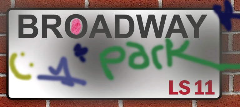
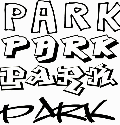
In the title there are two contrasting words which links to the two contrasting families in the soap. 'Broadway' generally refered in an upper class way. And then the more common phrase 'Park'. I am thinking about making the words different fonts to represent their meaning. But first I am going to look at some fonts for the word PARK. 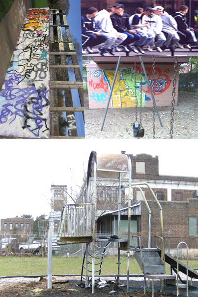
When I think of park in a way relating to the soap opera, this is what I think of:
(As it is representing the working class family, this is some of the steretypes)
- Kids in a park drinking
-Naughty kids
-Benches
-Graffiti
FONTS
COMBINING THE TWO